Thursday, June 10, 2010
Lab 8
Laboratory 8:
Asian, Black and "Other" Population Distributed by County
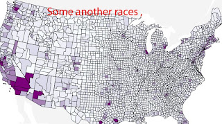
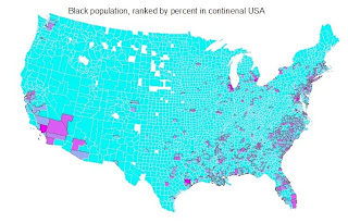
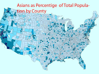
The objective of this Laboratory was to create choropleth maps that show the county level race data ranked by percent obtained from US and created maps for “Black, Asian and another Race alone” people, in continental USA. The date were downloaded from U.S. census website and calculated the percentage of the total county population for above groups. With ArcGIS I created 3 colored maps. In these maps, the darkest color is related to the maximum population for a given group. The lightest colour is for less population density. The break points are included in given legends.
According to the data obtained from Census USA only few counties had less than 30% Asian. In the 48 states, the largest concentration of Asians is in California, in greater Los Angeles. Generally, a very little Asian representation in large states like Texas, Atlanta and New York City.
A second map is about distribution of Some other race alone. Because I got a problems with converting .xls to data base file this maps is from Census site. It can be seen that “Some other race” density is distributed close to Southwest and west coast because probably many Spanish speaking people from arrive in the USA. The same population is also in the cities like New York, Boston and Miami.
Black distribution is high in Southeast USA. I do not know the reason, but probably it is related to agricultural production over there where is more easily to find a job. The better job is also the reason for such big population in black people in areas as Los Angeles, NY and Micvhigan where auto production is well developed.
My experience using ArcGIS was encouraging. A ArcGIS is very useful , but not easy for me , a man never study geography before in his life and working in totally different area of study- material science and engineering. I got a lot of experience, even working slow, with Arc GIS and it made me more self-confident about data acquisition and processing them in ArcGIS software.
Thursday, May 27, 2010
GEOGRAPHY 7 LAB 7
Fire is a naturally occurring phenomenon which humans have learned to deal with throughout history. When fire burns uncontrollably, it became a source for disaster to all environmental areas. The Los Angeles Station Fire august/September 2009 is an example of such tragedy. According to statistics, the first "big one" happened in December of 1927 and since then more than 20 catastrophic wildfires in Los Angeles County have happened. This was the lesson for local government to begin organized fire protection.
The wildfire, called the Station Fire was considered as a tragedy in Los Angeles County. During about 50 days it devastate 160,577 acres of land, destroyed 89 homes and 209 structures, scrub oak and mature trees and destroying three dozen cabins inside the Angeles National Forest, 1. The reason for this fire are different including local natural sources and hypothesis about terrorists action. As mentioned by US Forest Service intense heat caused the soil to 'seal' itself , drys and becam easily fire able. The final cost was estimated $93 million only for environment ,plus much more for home owner it this areas.
Basic Information.
Incident Type- Wildfire
Cause - Arson
Date of Origin Wednesday August 26th, 2009 approx. 03:30 PM
Location Los Angeles River Ranger District / Angeles National Forest
Incident Commander K. Giao
Current Situation
Total Personnel 34
Size 160,577 acres
Percent Contained 100%
GIS provides the Geographic advantage to study the Station Fare on LA from August/September. Geographic information system(GIS) technology provides tools and data to depict and analyze the disaster. The data required are Elevation, Water sources, Weather conditions, locations of natural resources, and Fire station locations and infrastructure and population.
In this laboratory projected shapefiles were downloaded from LA county enterprise GIS website and software ArcGIS was used.
The weather conditions on August/September 2009 worried all of us in the state of California. The temperature in Southern California was abnormally hot with very little humidity present in the atmosphere and the hot local winds were very intense. The map I decided to create is about the Station Fire in the LA nation park and recreational areas. It can be seen the area of the fire and compare it to the total artea of the county. Using several layers one can get better sense of the fire scale.
BIBLIOGRAPHY
1. Los Angeles County. "GIS Data.. at http://gis.lacounty.gov/eGIS/?page_id=117.
U.S. Forest Service. http://www.inciweb.org/incident/article/9512/ .
2. The Massive Californian Wildfires Encircling Los Angeles , at www.dailymail.co.uk/news/worldnews/article-1210417/.
3. Council for Geoscience. "Landslides and Slope Instability." Council for Geoscience. 14 March 2009. The Collective Advisory (TCA). 22 November 2009.
4. USGS. "Emergency Assessment of Postfire Debris-Flow Hazards for the 2009 Station Fire,
5. USGS. "2009 Station Fire, Dunsmore Canyon, Glendale California." USGS - Science for changing the world. 13 October 2009. U.S. Department of the Interior. 11 November 2009.
Saturday, May 22, 2010
GEOGRAPHY 7 LABORATORY 6
AREA OF INTEREST:
MALIBU
Longitude -76.1 decimal degrees
Latitude 36.85 decimal degrees
The spatial reference is GCS North American 1983,
UTM Zone 10.
My choice was an area of Malibu, California, because the spot has a beautiful Beaches, Parks & Attractions the same time all over the year. The Story of Malibu is presented by the Malibu Lagoon Museum and dedicated to preserving Malibu's unique history. This story tells the saga of scenic and historic Malibu with its 23 miles of beautiful coastline, rugged mountains, wooded canyons, and sheltered coves. Here you will find an exciting portion of California history from the time of Malibu's first residents, the Chumash Indians, to the present day. (Malibu, Lagoon Museum).
Monday, May 17, 2010
GEOGRAPHY 7 LABORATORY 5
This Laboratory exercise introduced to projecting GIS data to ArcGIS. Map projection deals with spatial data defined on the curved surface of the earth and transforms it to the two dimensional surface of a map by mathematical algorithm . This exercise has been completed using ArcGIS 9.2. All data needed for this exercise were provided by Geography 7 Laboratory database.
Conformal projection is known as a Projection which preserves the original shape of the area of interest but not the area or distance. For instance, when we use Mercator Map as a world map it does hold distortion when you look at the map.
The area of the world is presented as Equal-Area projection, but it consist distortions. For example meridian are equally spaced , but the parallels are not. It is particular mapping from a sphere to a disk. It finds application for statistical analysis and in various scientific disciplines, for plotting the orientations of lines in three-dimensional space.
From equidistant maps projections we can measure a true distances from center of the projection. Equidistant map do have flaws too and can be misleading.
Equidistant maps preserve the distances between certain points, but scale is not maintained correctly by any projection throughout an entire map.” Most Equidistant projections have one or more lines in which the length of the line on a map is the same length (at map scale) as the same line on the globe, regardless of whether it is a great or small circle, or straight or curved. Such distances are said to be true.”( ArcGIS, Help file)
Distance between Washington DC and Kabul measured in this laboratory are about 4836. 6 miles
Thursday, May 6, 2010
GEOG7 LAB 4
ArcGIS is a software product , created my ESRI. With ArcGIS Desktop users are able to analyzes, models, visualizes, and shares geography spots. Using included tools you can build your own applications. ArcGIS Desktop gives you an overview of the program as well as it shows you how to access the basic functions of the software. A step by step tutorial introduce the readers with the basic framework of ArcGIS Desktop—including the structure of each, the functions each performs, and how they can be used together. The main application in ArcGIS is ArcMap, which is used for both mapping and editing task.
I use this program to create my first map. To become familiar with the program it took about 15 hours, but it was helpful. Using a given tutorial I did not meet seriously troubles with it. To became more skilled I need to work on it more than two weeks.
Even the program is user friendly written, one shod be detail oriented. The man disadvantage is the price of the program, but using lab facilities it is acceptable for everyu UCLA student. It is a program which take a time and you should be very patient.
ArcGIS has a big potential collecting a ton of information. “Regardless of whether you are using ArcGIS in a desktop, mobile, or server environment, the new enhancements will improve how geographic information is leveraged throughout your enterprise. ArcGIS 10 is expected to be available in June 2010., (http://www.esri.com)
Thursday, April 22, 2010
GEOGRAPHY 7 LAB 3 NEOGRAPHY , MALIBU PEAR
The objective of this map is to obtain direction to Malibu Pier as a heart of California’s surf culture starting from UCLA campus. In this famous place surfers from around the world come to Surfrider Beach. The spot is also known as a three-point break that offers rides of 300 yards or more.Malibu sport fishing pier, live bait and charter boats make it one of the most attractive destination in the world.
Commentary on Neogeography:
Neogeography combines the cartography and GIS making them user friendly environment but it also has many pitfalls. Because geographical maps using Google tools are easy to create and they are acceptable for Internet public there is not warranty about reliable information which they offered. So all remain to the morality and ethics of the author.
There are also negative consequences because neo-maps exist some personal information whis is shown to the public. In this point of view it can lead to some troubles for the creators. Even above mentioned negative consequences, neogeography has much more potential nowadays. Using Google tools for example makes our life easier and more interesting.
Follow are the links to the map and how to get to Malibu per from UCLA
campus.
http://maps.google.com/maps/ms?client=firefox-a&hl=en&ie=
UTF8&t=h&msa=0&msid=117025429257544465830.000484d2764fd36
f30dd3&ll=34.031038,-118.470383&spn=0.339152,0.617294&z=1
1
http://www.youtube.com/watch?v=RnrR-3ElCgM
.
Thursday, April 15, 2010
GEOGRAPHY 7 Laboratory 2
1. What is the name of the quadrangle? Ans: The name of the quadrangle is BEVERLY HILLS , who is located in California
2. What are the names of the adjacent quadrangles? Ans; The names of the adjacent quadrangles are Canoga Park, Van Nuys, Burbank, Topanga, Hollywood, Venice, and Inglewood given as a legend on the bottom of the map.
3. When was the quadrangle first created? The quadrangle first created was 1927, referred to the bottom of left corner.
4. What datum was used to create your map? Ans. The last revision date of Beverly Hills map was 1995
5. What is the scale of the map? Ans. The map scale indicates the ratio or proportion of the horizontal distance on the map to the corresponding horizontal distance on the ground. The given map has a scale of 1:24,000 which means one inch on the map is 24,000 inches on the ground.
6. At the above scale, answer the following:
a) 5 centimeters on the map is equivalent to how many meters on the ground? Ans. 1199.99 ~1200m, [ because 1 inch =2.54 cm; 1 m= 100 cm]
b) 5 inches on the map is equivalent to how many miles on the ground? Ans. 1.89 miles [24000x2.54x5/]
c) one mile on the ground is equivalent to how many inches on the map? Ans. 2.64 inches, (1 mile =63360 inches on ground)
d) three kilometers on the ground is equivalent to how many centimeters on the map? 12.5 cm on the map [ 3km=118110.2 inches]
7. What is the contour interval on your map? Ans. Contour interval is the difference in elevation between two adjacent contour lines. The contour interval is 20 feet printed on the map.
8. What are the approximate geographic coordinates in both degrees/minutes/seconds and decimal degrees of:
a) the Public Affairs Building; degree/minutes/sec :34°4’10"N; -118°25’50”W DD : 34.07°N, -118.43°W;
b) the tip of Santa Monica pier;degree/minutes/sec 34.00N; -118.29.5W ; DD 34.00N; 118.5W
c) the Upper Franklin Canyon Reservoir; 34.07N;-118.24.30W; DD 34.1N; 118.4W
9. What is the approximate elevation in both feet and meters of:
a) Greystone Mansion (in Greystone Park); 650ft or 198m
b) Woodlawn Cemetery; 140ft or 42m
c) Crestwood Hills Park; 769ft or 234m
10. What is the UTM zone of the map? Zone 11
11. What are the UTM coordinates for the lower left corner of your map? The UTM coordinates for the lower left corner are 3762000 Northing and 362000 Easting
12. How many square meters are contained within each cell (square) of the UTM gridlines? One million square meters in each cell of the UTM grid.
13. Obtain elevation measurements, from west to east along the UTM northing 3771000, where the eastings of the UTM grid intersect the northing. Create an elevation profile using these measurements in Excel (hint: create a line chart). Figure out how to label the elevation values to the two measurements on campus. Insert your elevation profile as a graphic in your blog.
14. What is the magnetic declination of the map? The Magnetic North is 14.0 degrees East
15. In which direction does water flow in the intermittent stream between the 405 freeway and Stone Canyon Reservoir? The stream between the 405 freeway and the Stone Canyon Reservoir flows from the direction From North to South
16. Crop out (i.e., cut and paste) UCLA from the map and include it as a graphic on your blog.
Subscribe to:
Posts (Atom)